Thursday, 5 March 2015

Tuesday, 3 March 2015


Tuesday, 17 February 2015
Music Magazine (Draft)
The three images below are all drafts of my music magazine, that were taken at the time of uploading this post.
At the time of posting, I have completed quite a lot of my music magazine. I have so far successfully chosen and applied the appropriate font and texts. I had selected the majority of my images and successfully edited them on the software Photoshop.
The next thing I will do is re-take my front cover image as I felt my image previously didn't come across well on a camera due to bad lighting. Once that is completed, my front cover will be almost complete. I will then align my text so that it looks professional and not amateur.
On my contents page, I will next add the final version of my front cover as part of a subscription plug to attract readers to my magazine on a long term basis. Likewise to my contents page, I will edit the headlines to ensure they are aligned appropriately. I will reposition arrows to make them coincide with my front cover as they are titled 'on the cover'.
For my double page spread, I will remove any unwanted lines around the edge as I was unable at this time to do so. By reverting back to Photoshop I will solve this problem immediately. There is also a few errors regarding spelling and punctuation which I will change once I improve my magazine. I will also reposition my pull quote as it look's segregated from the entire spread.

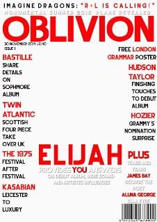

At the time of posting, I have completed quite a lot of my music magazine. I have so far successfully chosen and applied the appropriate font and texts. I had selected the majority of my images and successfully edited them on the software Photoshop.
The next thing I will do is re-take my front cover image as I felt my image previously didn't come across well on a camera due to bad lighting. Once that is completed, my front cover will be almost complete. I will then align my text so that it looks professional and not amateur.
On my contents page, I will next add the final version of my front cover as part of a subscription plug to attract readers to my magazine on a long term basis. Likewise to my contents page, I will edit the headlines to ensure they are aligned appropriately. I will reposition arrows to make them coincide with my front cover as they are titled 'on the cover'.
For my double page spread, I will remove any unwanted lines around the edge as I was unable at this time to do so. By reverting back to Photoshop I will solve this problem immediately. There is also a few errors regarding spelling and punctuation which I will change once I improve my magazine. I will also reposition my pull quote as it look's segregated from the entire spread.


Tuesday, 3 February 2015
Feedback - Double Page Spread

My teacher has assessed my double page spread in numerous ways. He has graded my work entirely in the level 4 section. Level 4 would equate to Grade A/B.
A strength of my assessment was that I had used great conventions and a good image use. He also added that my magazine had a clear representation.
Areas to improve included moving my pull quote so that it would be more noticeable and easier for my audience to read and to possibly add a box entailing Elijah's new album.
Tuesday, 27 January 2015
Feedback - Contents Page

The image above shows the feedback I have received from my class about my contents page. I received positive and constructive criticism in order to improve my final product.
The good feedback I received included the use of a band index as this is quite a conventional way of displaying bands/artists that my magazine will feature. A popular response from my magazine was that layout of my contents page looks professional due to the fact I have taken inspiration from a similar house styled magazine - NME. Someone also felt that the use of arrows was a clever feature as it directs the reader instantly to what articles that have interested them on the front cover.
I have also received constructed criticism from my peers. A suggestion within my feedback included inserting an image within the subscription box at the bottom of the page. This is something I intend to do when my front cover is complete. Therefore, I am happy that this was picked up on. A critique included that the text size within my article descriptions were too small. Therefore, I will edit this to make the text bigger so a wider audience will be able to read it.
I am happy with the criticism received as I feel this is exactly what I would change in order to improve my magazine.
Tuesday, 20 January 2015
Feedback - Front Cover

Specific strengths my teacher noted was that I have included a clear representation of a music magazine. He also mentioned that my layout was set out well.
Targets I have been set in order to improve on my front cover are to remove a subheading or two. This would to allow my front page look less busy as this can sometimes be too overpowering. The incorporation of a website at the bottom of the page would increase the realism of my magazine as this a convention.
Tuesday, 2 December 2014
Original Image vs. Edited Image
The images below are my original images comparing to my edited image. I firstly increased the brightness to remove any dark and dull patches from the image. I made an adjustment to two of my images by transforming the photo to black and white, in order to add a dramatic effect. I have edited this second image by altering the brightness so that the background behind looks sharper and cleaner. This has also made the model stand out more. On all three photos I used the spot healing brush tool in order to remove any unwanted blemishes.


Subscribe to:
Posts (Atom)